EMAGINE
Responsive web design
Emagine is an innovative online clothing store specializing in casual, elegant, and denim outfits. Their mission is to redefine online shopping by delivering an exceptionally straightforward and enjoyable experience for our customers.
THE NEED
Project duration
September 22 - November 22
My role
Ux designer leading Emagine’s Web Design
Engaging in interviews and user research, crafting paper and digital wireframes, and creating both low and high-fidelity prototypes. Conduct usability studies and prioritize accessibility considerations while continuously iterating on designs, ensuring responsiveness across different devices.
Responsibilities
Despite the availability of online shopping for not less then a decade , a noticeable divide persists between the digital and physical shopping experiences.
Emagine aspires to bridge this gap and enhancing online shopping revenue. By aiming to imbue shoppers with the same level of confidence and satisfaction that comes from the tactile and immersive nature of in-person shopping.
USER RESEARCH
Beginning with the research phase, I initiated interviews to gather valuable insights. Utilizing the collected data, I constructed empathy maps and User stories, which aided in pinpointing a specific user group that accurately represents potential users.
This primary user group comprises working women aged 20 to 45 years. To gain a comprehensive understanding, I closely followed these users throughout their shopping journey, meticulously observing pain points and identifying opportunities for enhancing the overall user experience.
Furthermore, my findings revealed that a majority of users experienced satisfaction and delight during the shopping process. However, it became evident that certain challenges still emerged along the way.
Notably, the primary pain points centered around making fit and sizing decisions, investing substantial time in scrolling through reviews, navigating searches, and completing the checkout process.
STARTING THE DESIGN
INFORMATION ARCHITECTURE
Drawing from the primary pain points, I formulated a comprehensive site map. My aim was to strategically enhance the information architecture to optimize website navigation.
The structure I crafted is designed to facilitate a seamless user flow and to effectively guide users towards their objectives in an engaging and efficient manner.
PAPER WIREFRAMES SKETCHES
During the process of sketching various website page layouts, my focus was on crafting a straightforward introduction that would help users comprehend the new image feature. Simultaneously, I aimed to enhance the user flow, addressing the challenges related to sizing decisions and other encountered obstacles.
In pursuit of these goals, I strived to maintain user engagement and prevent any sense of confusion or disorientation within the feature-rich environment.
Continuing with my design process and having gained deeper insights into user pain points, I focused on crafting effective design solutions and translating them into wireframes.
A notable addition was the implementation of novel features: the 'Self Fit and Size Images'. This innovative functionality allowed users to visualize how items would fit on their own images, eliminating the need for imaginative visualization. Furthermore, I introduced the option for users to view items on diverse models with varying sizes, enhancing their decision-making process.
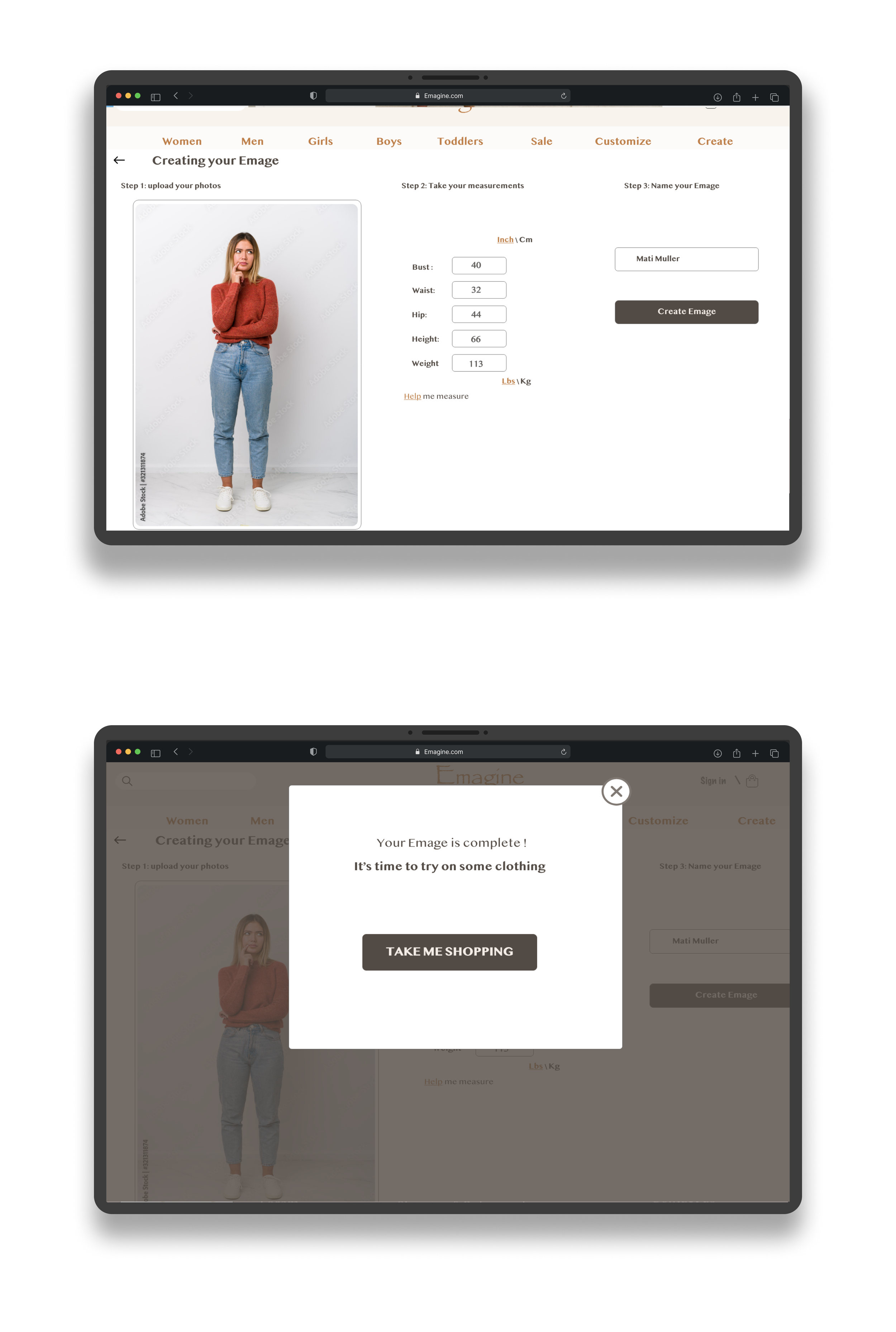
Crafting the "Create Your Image" page involves enabling users to input their measurements and photos. An intuitive help guide will be available, aiding users through the process. The result will be a personalized image, allowing them to virtually try on items and visualize how they look on their own image.
Keeping the User’s main pain points in mind, I worked on redesigning the digital wireframes, in order to improve the user experience from start to finish.
I utilized fundamental design elements like Dividers and negative space, scale and Hierarchy. Gestalt principals such as similarity and proximity to help the user reach their goal and attract their attention.
Putting an emphasis on useful buttons with visual design interactions were a key part of my strategy.
DIGITAL WIREFRAMES
To provide a great user experience across devices I was working to maintain consistency and continuity between the different screen sizes, by doings , the user could fluently continue on their journey free of confusion.
SCREEN SIZE VARIATIONS
I have conducted an Unmoderated Usability study, remotely in the United States.
The study had 5 participants and lasted about 25-30 min.
The study findings have revealed important issues that were immediately addressed in the polished designed.
USABILITY STUDY
REFINING THE DESIGN
My Hi-Fi prototype followed the same user flow as the lo-fi prototype.
It included both the design modifications of the usability study findings, and several changes suggested by members of my team.
HIGH FIDELITY PROTOTYPE
KEY TAKEAWAYS
Working together with Emagine’s team had been a great experience and has showed me how important it was to follow the User centered design approach. By addressing the User’s pain points, and staying focused on a consisted and unified visual design elements, we have managed to create positive feedback from our target users.
Improve AI based fit feature
Assistive technologies implementation


